Alpha testing for a B2B app
Research project aiming to support the MVP launch of a B2B mobile application for Signify (Philips Lighting Spin-off).
Project & objective
Role
Plan & conduct project (plan and script writing, participant scheduling, running interviews, note-taking, data analysis, synthesis, and presentation deck).
Team and collaboration
Lead UX designer, researcher, product owner, strategist, and marketing analyst. During the project, I was supported and collaborated closely with the UX lead designer.
Problem space
A mobile B2B application close to release that had been user-tested at the beginning of the design phase a year before. It was important to determine how the tool was perceived by users and the overall usability before launch.
Research goals
Gather attitudes and impressions of participants towards the application, assess usability and task completion, and gather pain points to achieve tasks.
Project summary
Method
Five moderated interviews of 45 min. Three in-person for local participants, and two remote for the other market tested. The interviews were semi-structured with a discussion guide.
After the introduction and warm-up questions, I let them explore freely to gather first impressions. I prompted them to talk aloud and describe what they saw and their reactions to it from the beginning, so as they progressed exploring the app features I could gather their thoughts, and make follow-up questions. Before the end of the sessions, I asked them to complete a SUS (System Usability Scale) assessment. A series of 10 questions using a Likert Scale (5 response options) to gather subjective qualitative data that allowed us to understand how they perceived our product.
Constraints
Budget limitations regarding finding fitting research tools. The research tool the company was using (Userlytics) would not support app testing. I used Lookback which offered 5 sessions for free, which was the minimum number of participants we required.
Participants
Due to being under NDA, the team recruited internal participants from the relevant markets with knowledge of the product similar to the one needed by the target audience to use the tool.
Analysis approach
I used Notion as a repository by adding selected session notes, sentiments, tasks, tags, and themes. With all five sessions' data gathered and classified into Notion I grouped feedback snippets by similarity (task, feature, usability, bugs...). And in collaboration with the UX Lead Designer, we synthesized the information into bigger themes: the experience and implementation of the app.
Collaborations
During interview sessions, the team was invited to observe and provide feedback.
Deliverables
I shared the interview recordings and communicated findings across the app sections and its core features, the SUS score, and recommendations in a presentation deck.
End result
- The impressions of participants were positive and the application was found useful and appealing by the intended audience (experienced or less experienced) thanks to the different features and possibilities the tool offered to improve their workflow.
- It was relatively easy for participants to accomplish tasks in the app. They encountered some usability issues and thanks to the sessions we could pinpoint the barriers to achieving these tasks.
- Despite having found some usability issues the SUS assessment score was 87, above average (68), meaning overall the application was found useful and easy to use (see graph below with responses).
- Task completion was high as well, and barriers to achieving tasks were gathered.
- The findings were mostly usability issues and bugs.
- Insights led to the idea of possible future features.
- The main recommendations were to address usability issues encountered across task completion.
- Recommendations were prioritized to help with a successful app pre-launch.
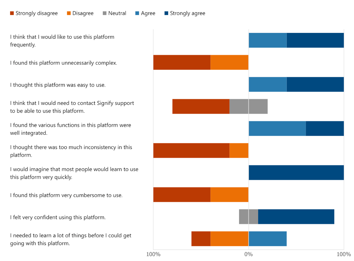
SUS assessment questions and graph showcasing response distribution
Projects Overview
Landing Pages for a global leaderProject type
EF Language WebsiteWeb / UX Research



EF Go BlogBranding / Web